in

data visualization : This Cartoon Explains How the Rich Got Rich and the Poor Got Poor.

Data visualization : This Cartoon Explains How the Rich Got Rich and the Poor Got Poor.
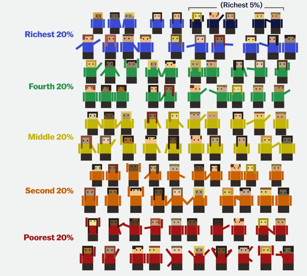
This Cartoon Explains How the Rich Got Rich and the Poor Got Poor.

By notoneofyourfans

At infographic.tv we provide handpicked collection of the best infographics and data charts from around the world.

  • Don’t forget to share the love !
  • What do you think?

    459 points
    Upvote Downvote

    Leave a Reply

    Your email address will not be published. Required fields are marked *

    Loading…

    Data Chart : 42 Ways To Succeed At Being The Boss [Infographic

    Video Infographic : Most Shocking Deaths Caught On Live TV