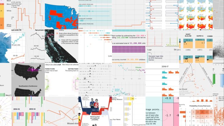
Data visualization : 538: The 45 Best — And Weirdest — Charts for 2018
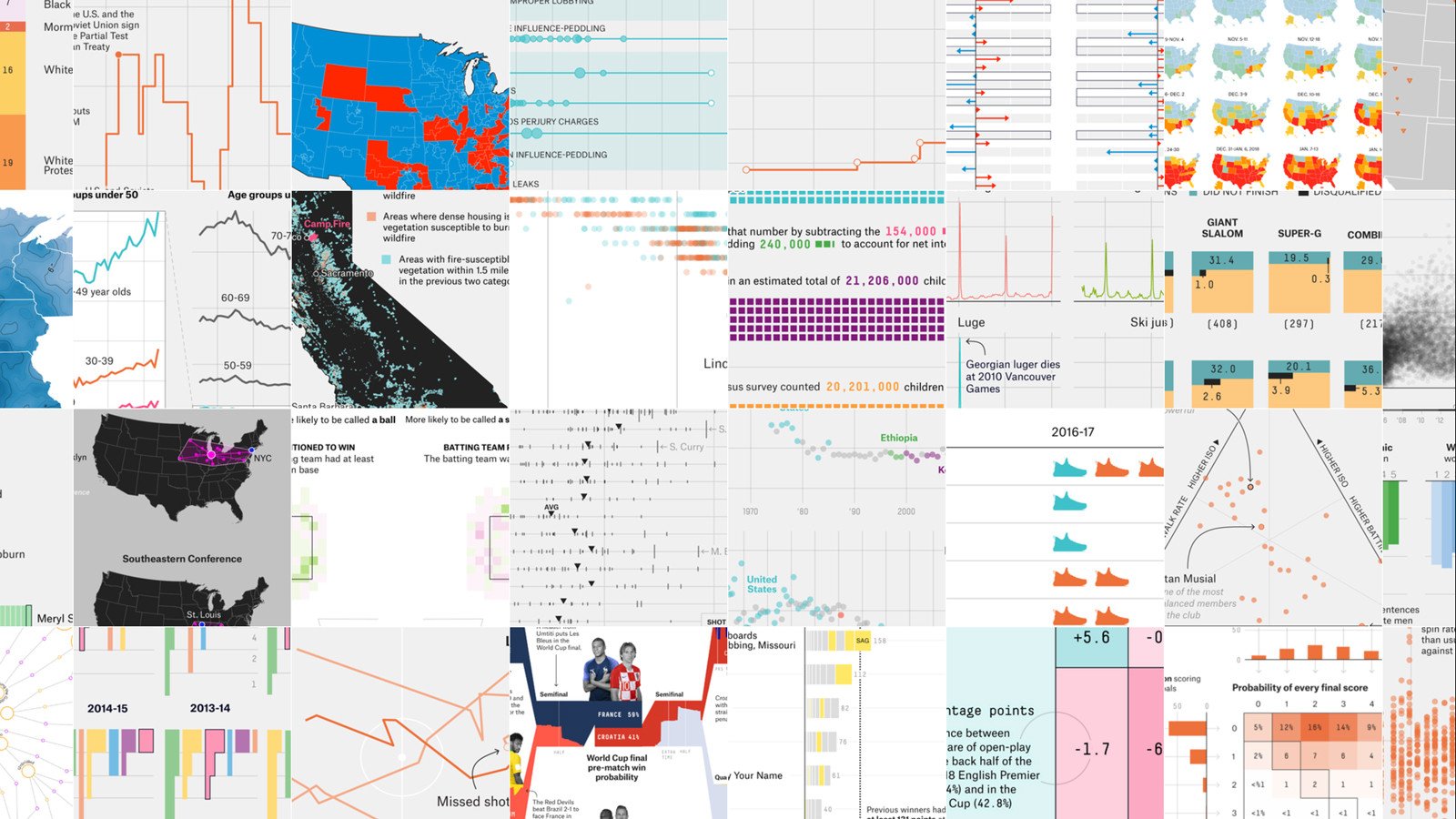
538: The 45 Best — And Weirdest — Charts for 2018
By gc3
At infographic.tv we provide handpicked collection of the best infographics and data charts from around the world.


Here you'll find all collections you've created before.