in

data visualization : [OC] Interactive visualization of topics in The Guardian articles throughout a decade

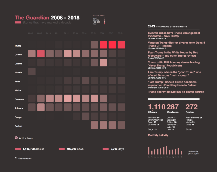
Data visualization : [OC] Interactive visualization of topics in The Guardian articles throughout a decade

[OC] Interactive visualization of topics in The Guardian articles throughout a decade

By r3cycle

At infographic.tv we provide handpicked collection of the best infographics and data charts from around the world.

  • Don’t forget to share the love !
  • What do you think?

    459 points
    Upvote Downvote

    Leave a Reply

    Your email address will not be published. Required fields are marked *

    Loading…

    Video Infographic : #012 Keynote Slide Fast Design Infographic Fishbone鱼骨图幻灯片2019

    Data Chart : How Small Businesses Should Advertise On Facebook [Infographic