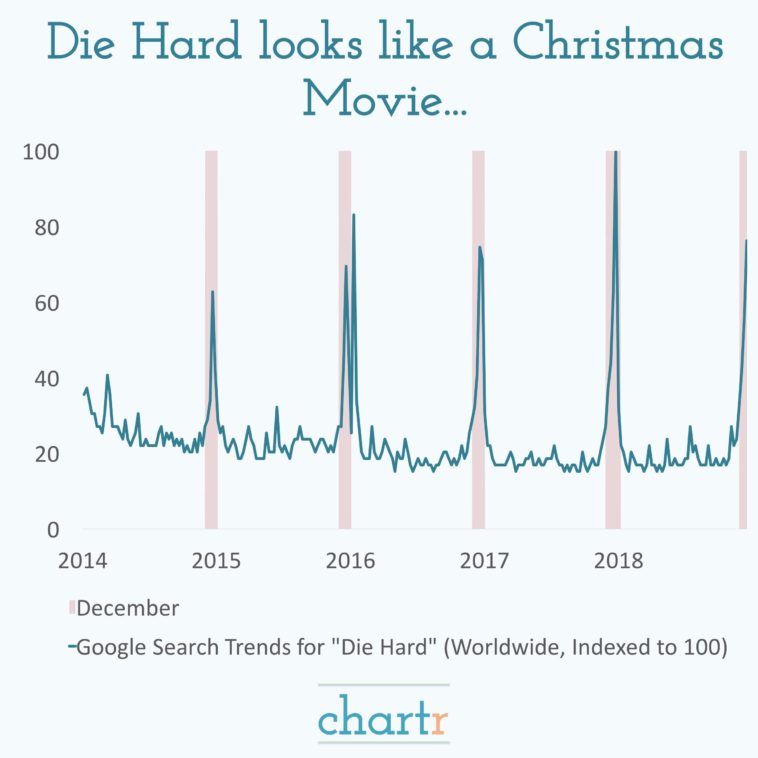
Data visualization : Die Hard debate settled once and for all… up to 5x the search volume in December. [OC] from Instagram @chartrdaily which I run.
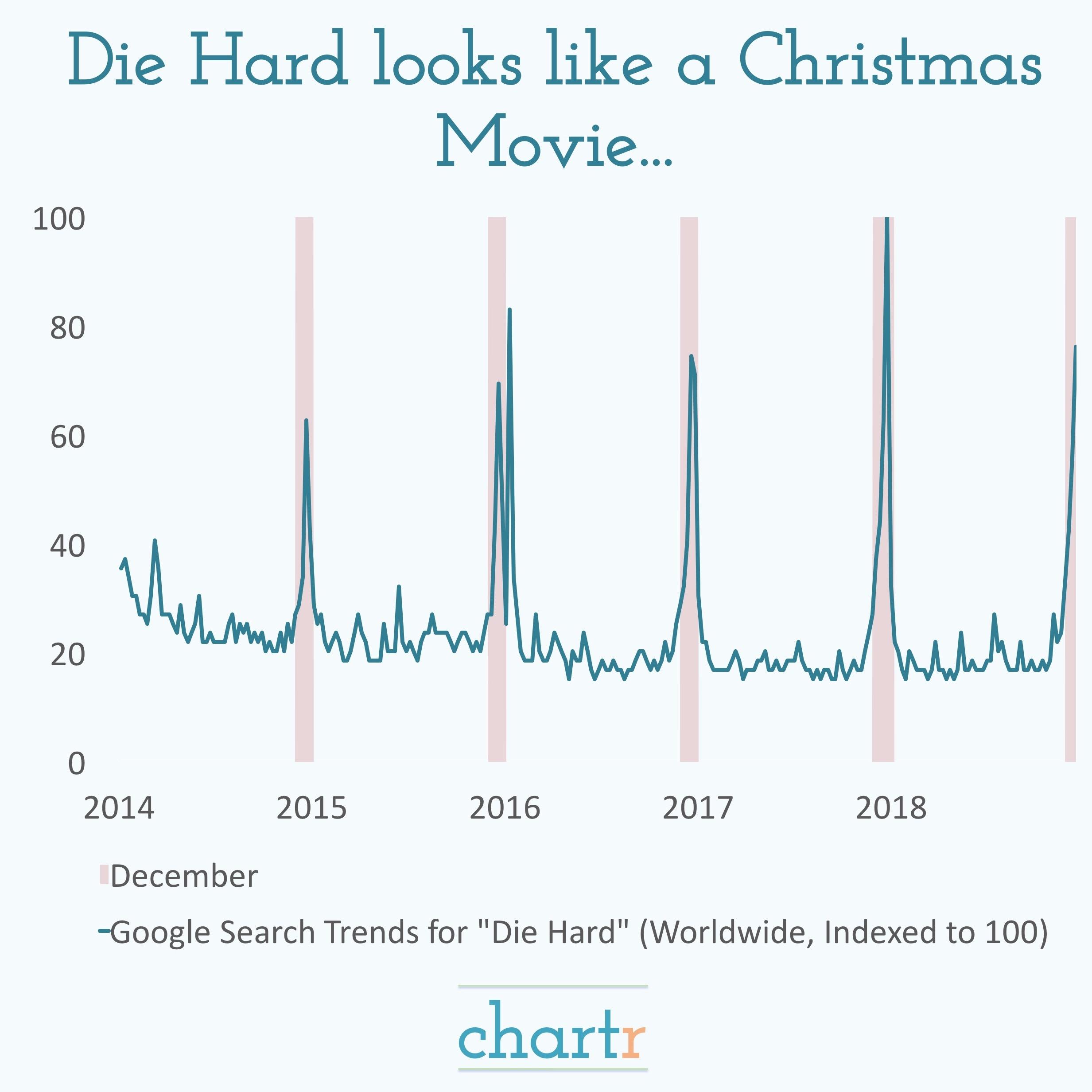
Die Hard debate settled once and for all… up to 5x the search volume in December. [OC] from Instagram @chartrdaily which I run.
By chartr
At infographic.tv we provide handpicked collection of the best infographics and data charts from around the world.