Data visualization : I Left My Job for 100 Days on a 30,000km Roadtrip – This is How Much I Spent (More Data and Charts in the comments) [OC]
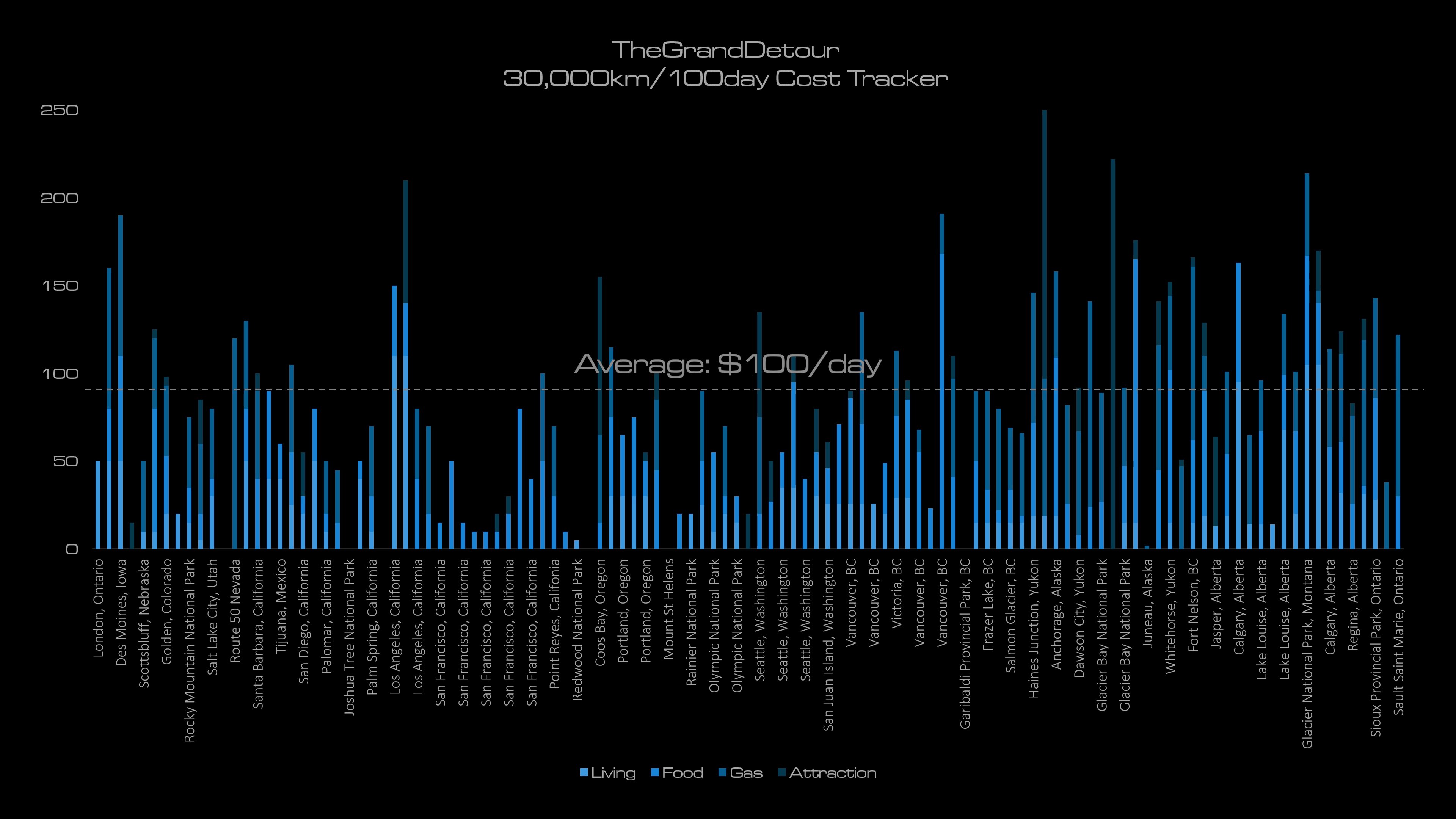
I Left My Job for 100 Days on a 30,000km Roadtrip – This is How Much I Spent (More Data and Charts in the comments) [OC]
By TheGrandDetour
At infographic.tv we provide handpicked collection of the best infographics and data charts from around the world.