
Map Info & Chart : 1700s Map of the Roman Empire
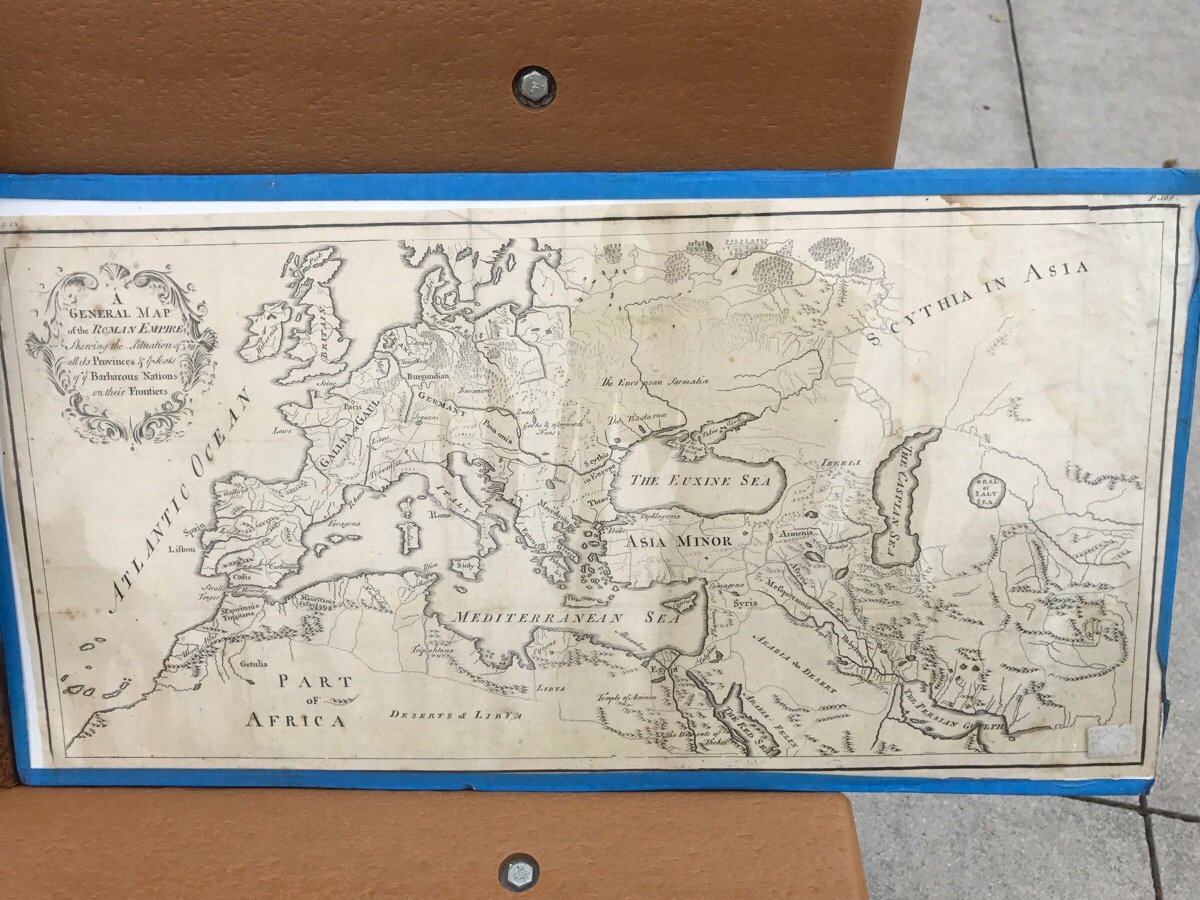
1700s Map of the Roman Empire
By zack7858
At infographic.tv we provide handpicked collection of the best infographics and data charts from around the world.


Here you'll find all collections you've created before.