in

data visualization : Start and end times of my sleep over the last 5 years (displayed in green & red, respectively) [OC]

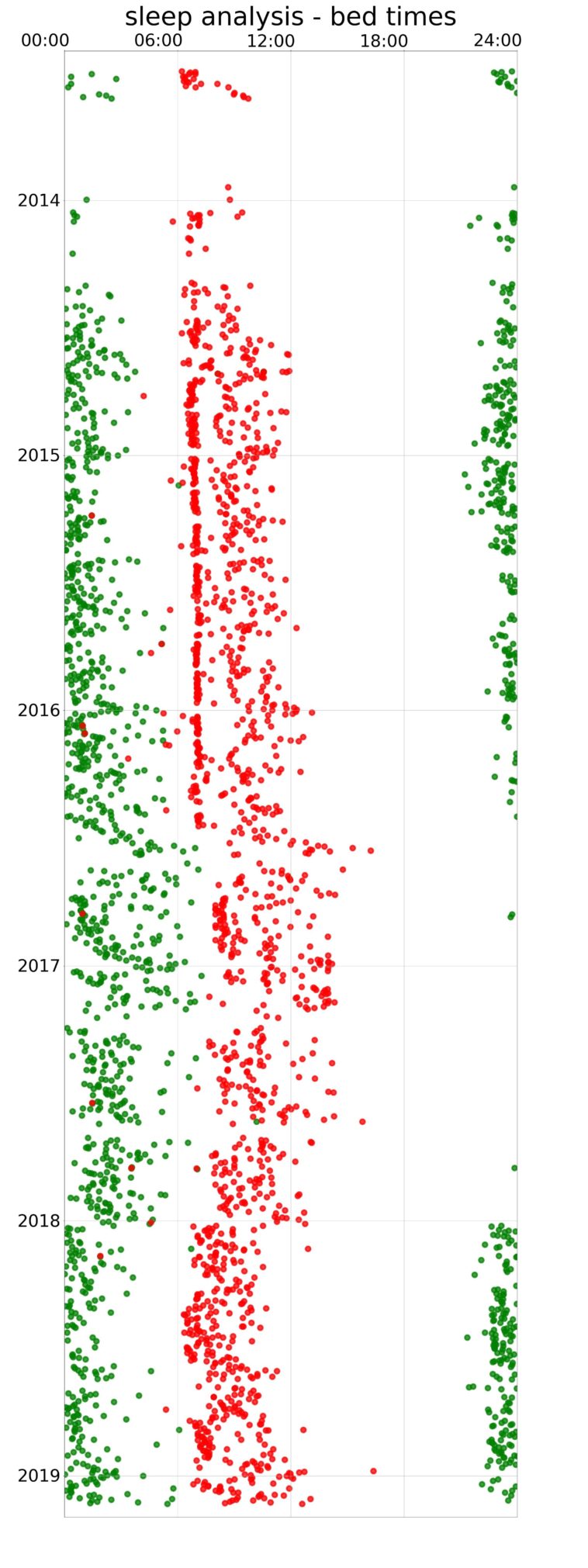
Data visualization : Start and end times of my sleep over the last 5 years (displayed in green & red, respectively) [OC]

Start and end times of my sleep over the last 5 years (displayed in green & red, respectively) [OC]

By TheRealZoidberg

At infographic.tv we provide handpicked collection of the best infographics and data charts from around the world.

  • Don’t forget to share the love !
  • What do you think?

    459 points
    Upvote Downvote

    Leave a Reply

    Your email address will not be published. Required fields are marked *

    Loading…

    Map : An awful map of Europe. Just look at Greece! And Poland, Bosnia and Hungary are independent here. How can you screw up this bad?

    Map : Districts of Santiago, Chile by human development index