in

Map : The red countries have a similar population

Map Info & Chart : The red countries have a similar population
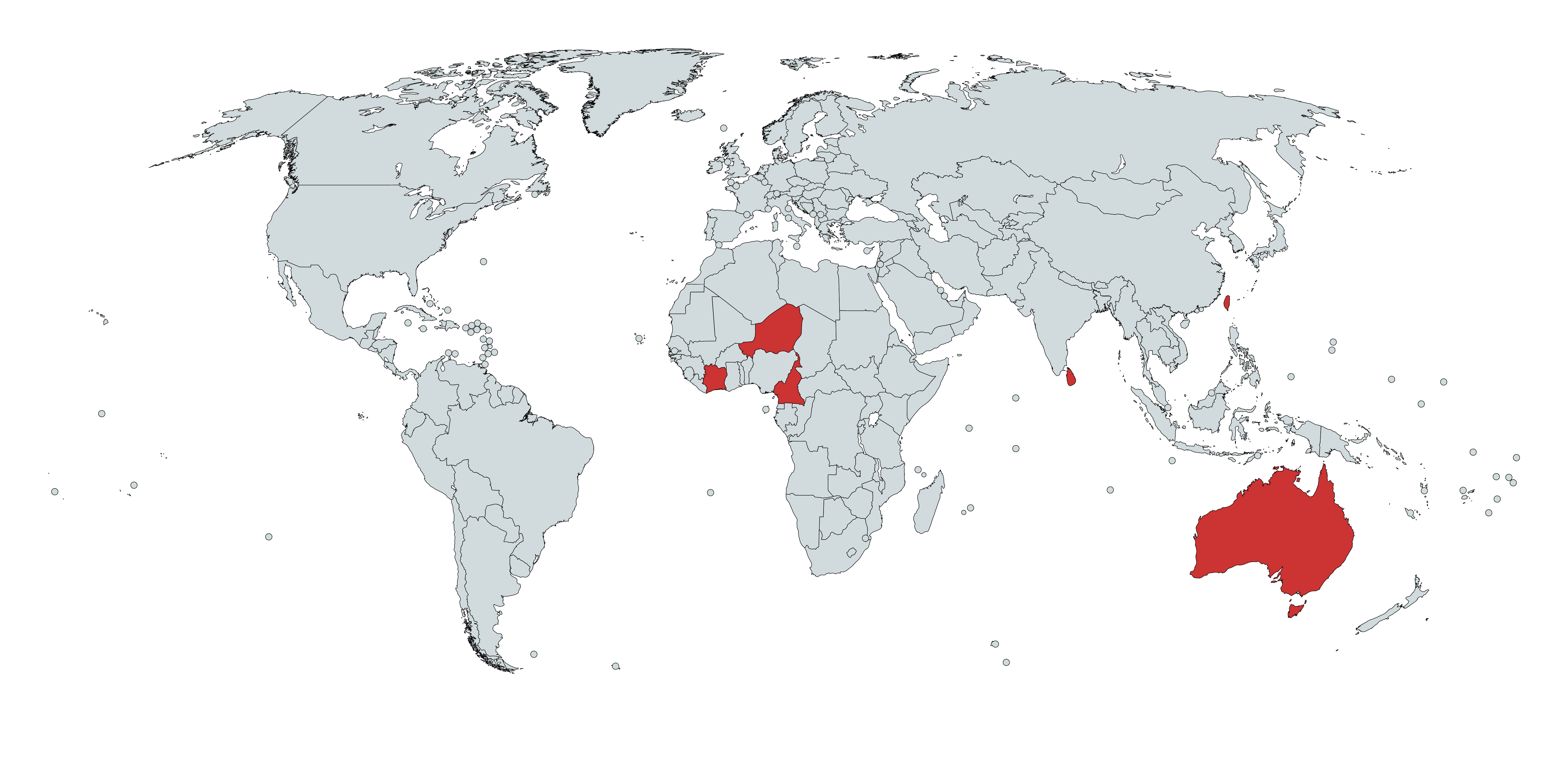
The red countries have a similar population

By xXdat_boi69Xx

At infographic.tv we provide handpicked collection of the best infographics and data charts from around the world.

  • Sharing is caring !
  • What do you think?

    459 points
    Upvote Downvote

    Leave a Reply

    Your email address will not be published. Required fields are marked *

    Loading…

    Video Infographic : Infographic Animation พรบ.คอมพิวเตอร์-WS

    data visualization : The Average Cost of a Case of Beer in each State, Visualized