
Map Info & Chart : US Sex Ratio by County 2017
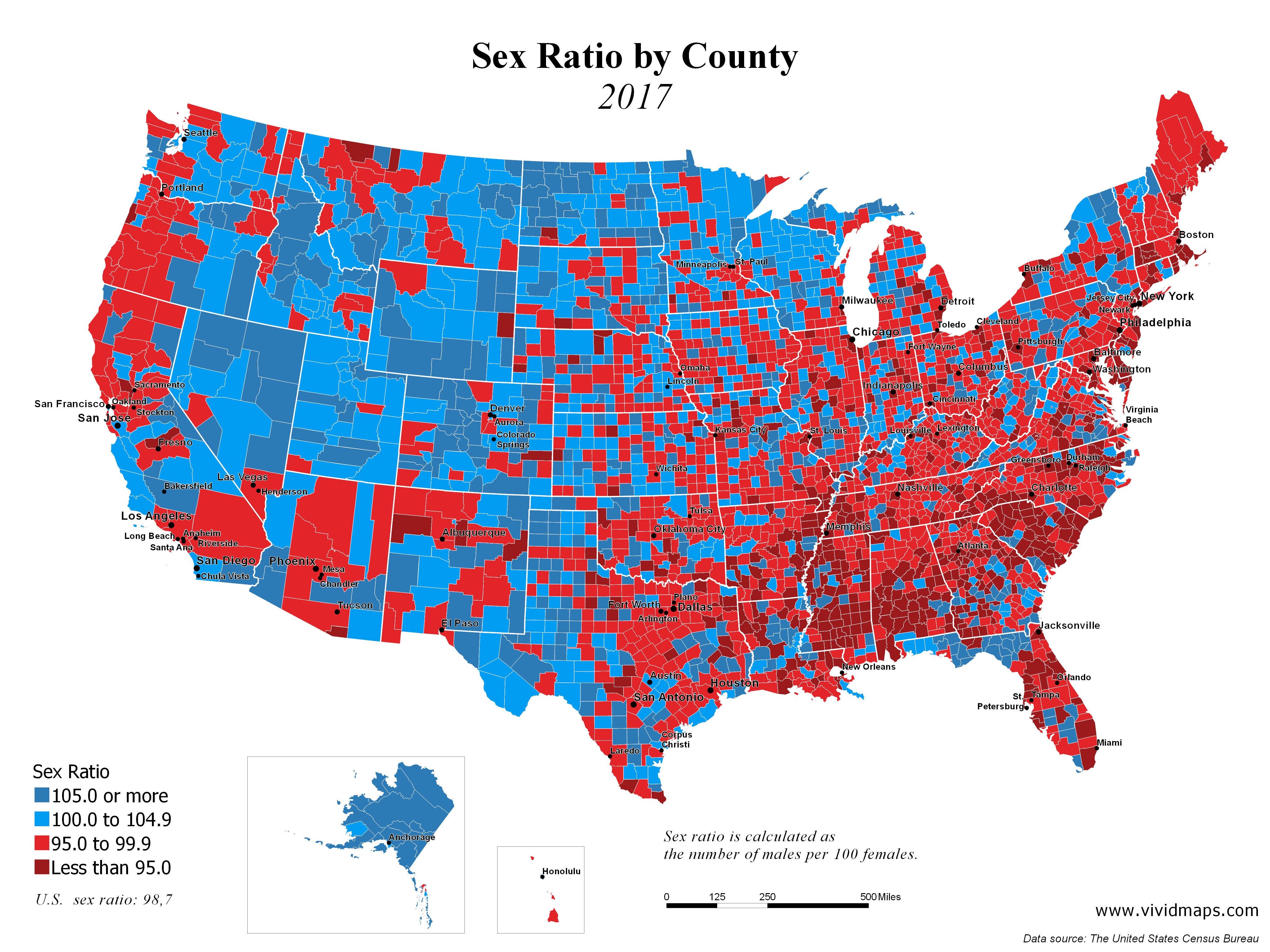
US Sex Ratio by County 2017
By clementyang
At infographic.tv we provide handpicked collection of the best infographics and data charts from around the world.

Here you'll find all collections you've created before.