in

Graph : When comparing ’% GDP contribution by State’ and…

Infographic : When comparing ’% GDP contribution by State’ and…
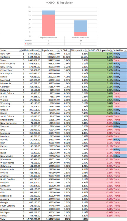
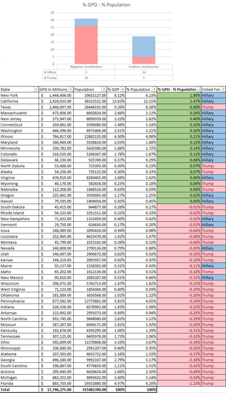
When comparing ’% GDP contribution by State’ and ‘Population % by State’, 26 of the 31 states with negative contribution went to Trump. Of the 19 states with positive contribution, 14 went to Hillary [OC]
http://daily-infographic.tumblr.com/

What do you think?

459 points
Upvote Downvote

Leave a Reply

Your email address will not be published. Required fields are marked *

Loading…

Map : Map of all countries and locations infected with the Coronavirus.

Graph : More from Ascher’s The Works.