Infographic : Visualize workstream – Help please

Hello Infographic community,
I am a subject matter expert in a very niche IT field. I spend a great deal of time focusing on my role at work and being a Dad at home. I don’t have the bandwidth to learn an entirely new skill set. I would like to create killer workstream reports for leadership but don’t have the time or skills to turn data into a cool Infographic report.
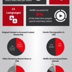
In short, wondering if there is an inexpensive service where I can find independent contractor help me create a template that visualizes my work load. I can update a fixed list of variables and Infographic is updated. Something similar to this:
[Example](https://youtu.be/QUcI1D8PRLM)
Thanks in advance.
By CH3ST3RCOPP3RPOT
Information graphics, visual representations of data known as infographics, keep the web going these days. Web users, with their diminishing attention spans, are inexorably drawn to these shiny, brightly coloured messages with small, relevant, clearly-displayed nuggets of information. They’re straight to the point, usually factually interesting and often give you a wake-up call as to what those statistics really mean.
At infographic.tv we provide handpicked collection of the best infographics and data charts from around the world.