in

Map : Percentage of people born outside the U.S. in each state

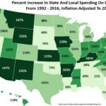
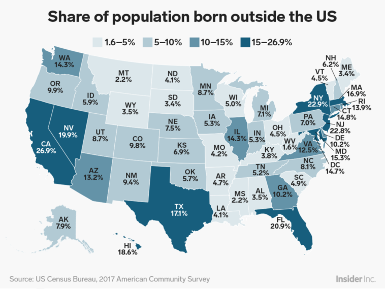
Map Info & Chart : Percentage of people born outside the U.S. in each state

Percentage of people born outside the U.S. in each state

By vyxegg

At infographic.tv we provide handpicked collection of the best infographics and data charts from around the world.

  • Sharing is caring !
  • What do you think?

    459 points
    Upvote Downvote

    Leave a Reply

    Your email address will not be published. Required fields are marked *

    Loading…

    Data Chart : How to Understand Your Gut and Keep It Healthy [Infographic

    data visualization : Has State Spending On Healthcare Increased More Than Inflation? [OC]