in Infographics Data Chart : What Does Your State do Best? [Infographic March 7, 2019, 7:55 pm 12.6k Views 0 Comments Data Chart : What Does Your State do Best? [Infographic What Does Your State do Best www.dailyinfograp… Sharing is caring, don’t forget to share this infographic ! 0 shares What do you think? 459 Points Upvote Downvote Leave a Reply Cancel replyYour email address will not be published. Required fields are marked *Comment * Name * Email * Website Next post
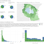
data visualization : How does the definition of a “Smallholder Farmer” in Tanzania impact our conclusions about them? (Link to interactive viz in the comments) [OC]