in Infographics Data Chart : What Matters Most to People Around the World [Infographic February 19, 2019, 11:37 pm 11.4k Views 0 Comments Data Chart : What Matters Most to People Around the World [Infographic Infographic about what people value the most in different countries. #infographic #matters#peoplearoundtheworld Sharing is caring, don’t forget to share this infographic ! 0 shares What do you think? 459 Points Upvote Downvote Leave a Reply Cancel replyYour email address will not be published. Required fields are marked *Comment * Name * Email * Website Next post
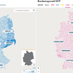
Map : You can still see the former GDR border by looking at the percentages the far-right and the far-left party got in the last election (2017)