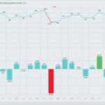
in Infographics Data Chart : When Does The Average American Retire? Depends On The State [Infographic January 8, 2019, 2:08 am 19.5k Views 0 Comments Data Chart : When Does The Average American Retire? Depends On The State [Infographic infographic shows employment rates in various U.S. states Sharing is caring, don’t forget to share this infographic ! 0 shares What do you think? 459 Points Upvote Downvote Leave a Reply Cancel replyYour email address will not be published. Required fields are marked *Comment * Name * Email * Website Next post