Data visualization : A project that captured the average Seattle Sky color for the past 11 months
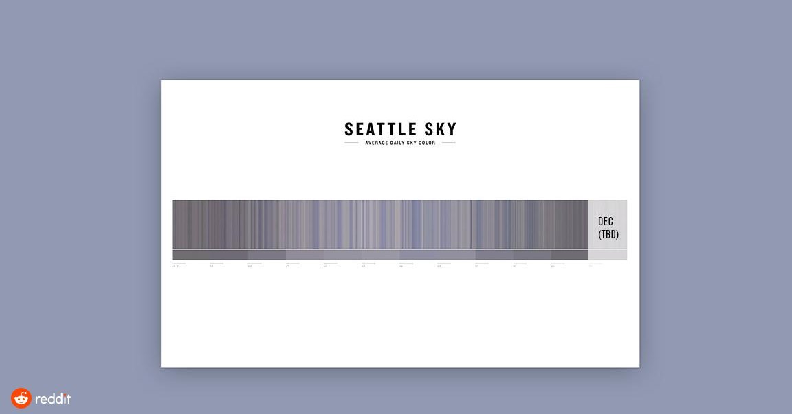
A project that captured the average Seattle Sky color for the past 11 months
By derisx
At infographic.tv we provide handpicked collection of the best infographics and data charts from around the world.