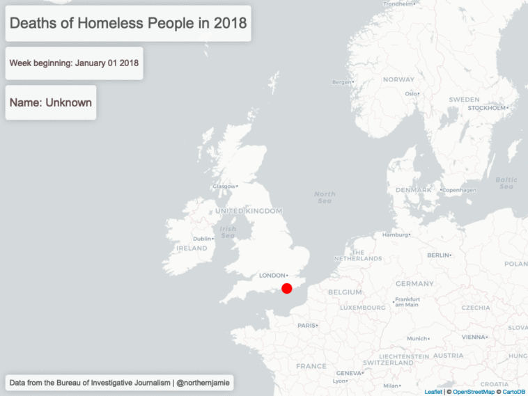
Data visualization : Animated map of deaths of homeless people in the UK in 2018 [OC]
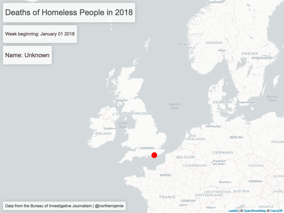
Animated map of deaths of homeless people in the UK in 2018 [OC]
By northernjamie
At infographic.tv we provide handpicked collection of the best infographics and data charts from around the world.