in

data visualization : Animated map of population density in the U.S. (1790 – 2010) – Vivid Maps

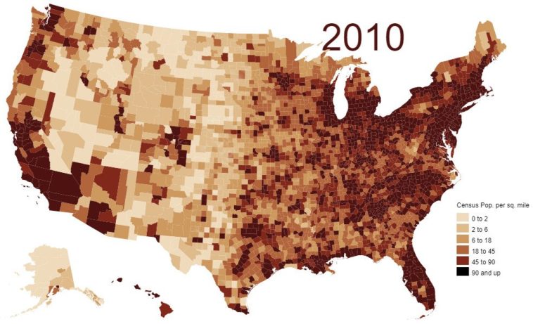
Data visualization : Animated map of population density in the U.S. (1790 – 2010) – Vivid Maps

Animated map of population density in the U.S. (1790 – 2010) – Vivid Maps

By amplifyoucan

At infographic.tv we provide handpicked collection of the best infographics and data charts from around the world.

  • Don’t forget to share the love !
  • What do you think?

    459 points
    Upvote Downvote

    Leave a Reply

    Your email address will not be published. Required fields are marked *

    Loading…

    Visual : Mountains of the world measured from sea level

    Data Chart : Got A Video Game Idea? Here’s How To Profit From It [Infographic