Data visualization : Average Household Income Compared to the COL Index of the 10 Most Populous Cities in the US [OC]
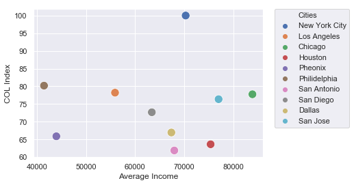
Average Household Income Compared to the COL Index of the 10 Most Populous Cities in the US [OC]
By TheNerdyProgrammer
At infographic.tv we provide handpicked collection of the best infographics and data charts from around the world.