Data visualization : Countries that appeared most frequently in NYT headlines each month since 1900 [OC]
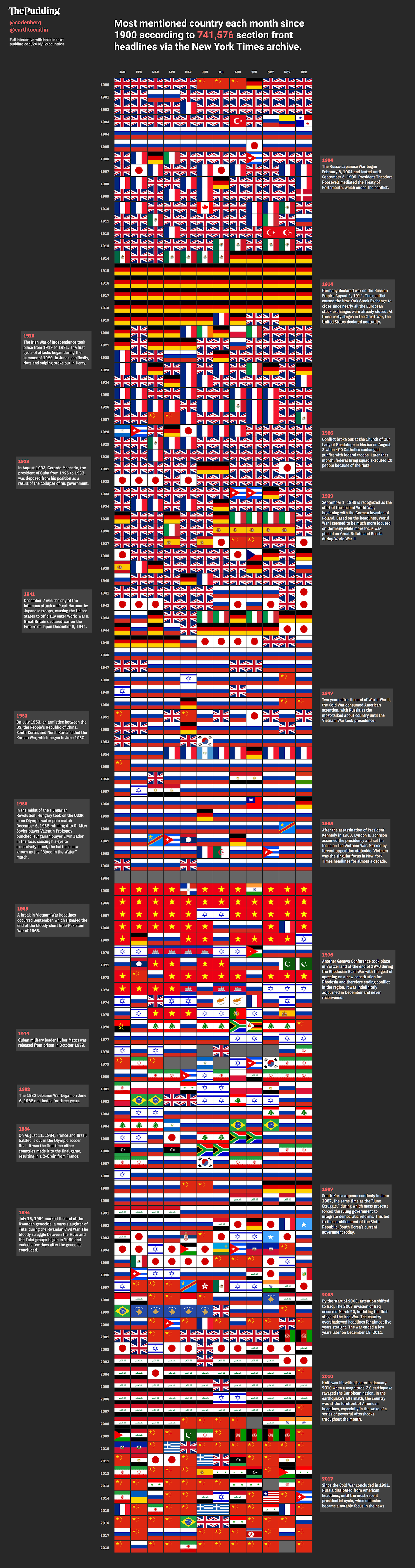
Countries that appeared most frequently in NYT headlines each month since 1900 [OC]
By codenberg
At infographic.tv we provide handpicked collection of the best infographics and data charts from around the world.