Data visualization : Does this represent your food expenditure? [OC]
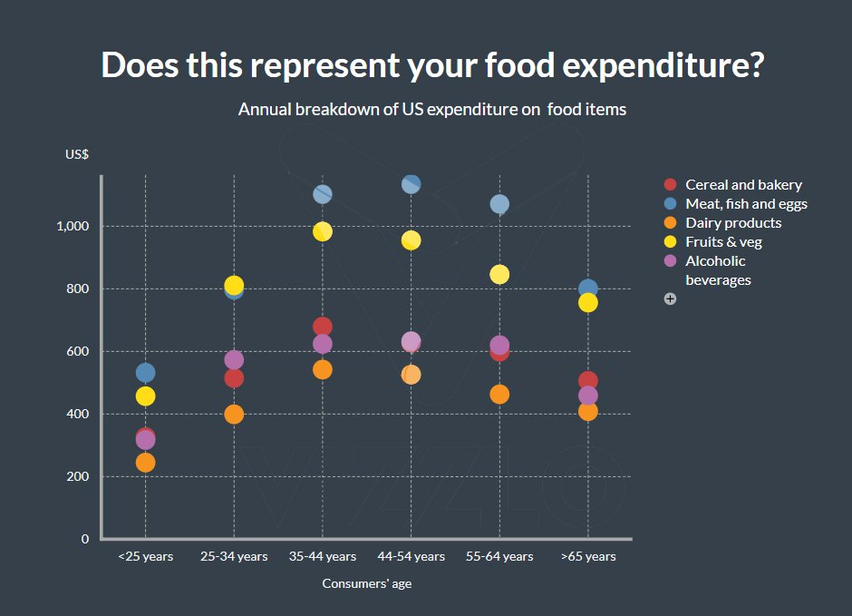
Does this represent your food expenditure? [OC]
By andrea_chou
At infographic.tv we provide handpicked collection of the best infographics and data charts from around the world.