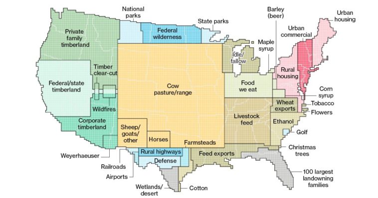
Data visualization : Explore America with this neat land use chart. It’s interesting to see just how much land goes to raising animals (41%,) vs to raising crops for human consumption.
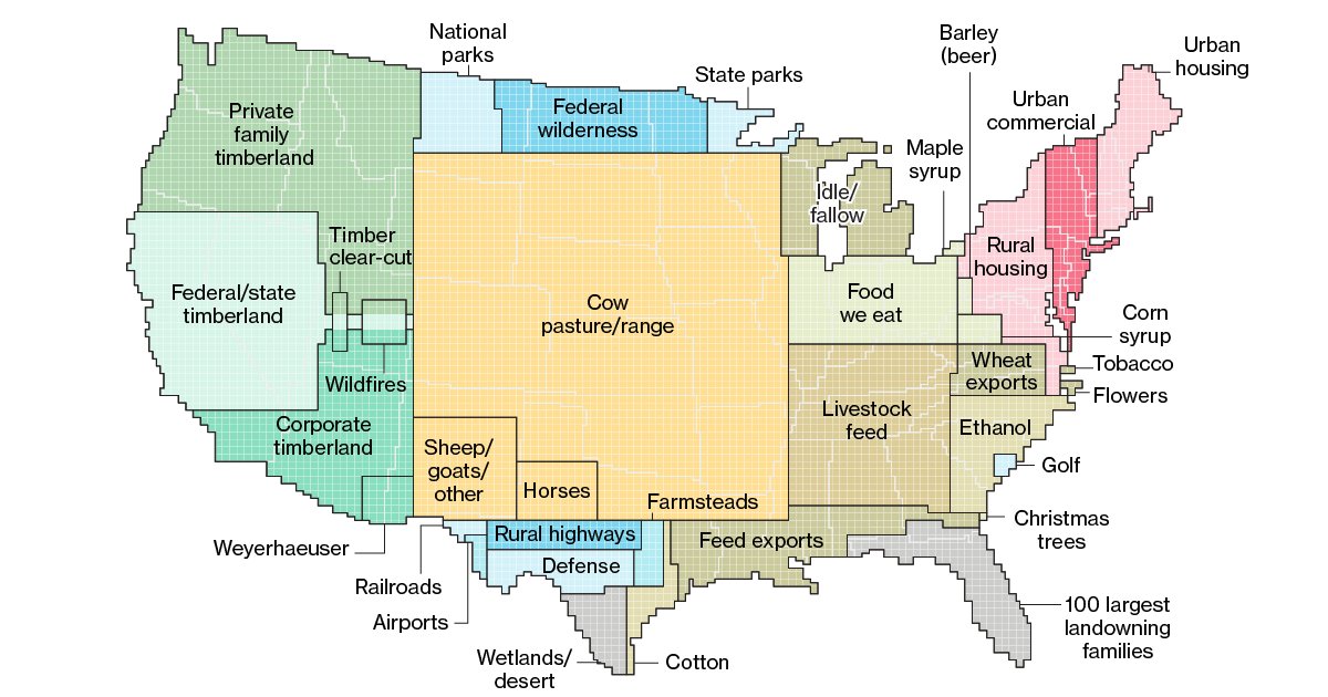
Explore America with this neat land use chart. It’s interesting to see just how much land goes to raising animals (41%,) vs to raising crops for human consumption.
By MrMamalamapuss
At infographic.tv we provide handpicked collection of the best infographics and data charts from around the world.