Data visualization : How a blue wave and red response explain a divided Pennsylvania

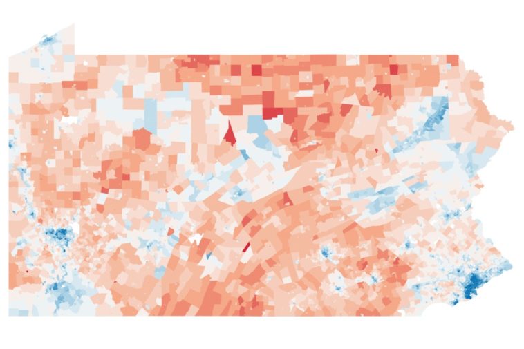
How a blue wave and red response explain a divided Pennsylvania
By nsvshields
At infographic.tv we provide handpicked collection of the best infographics and data charts from around the world.