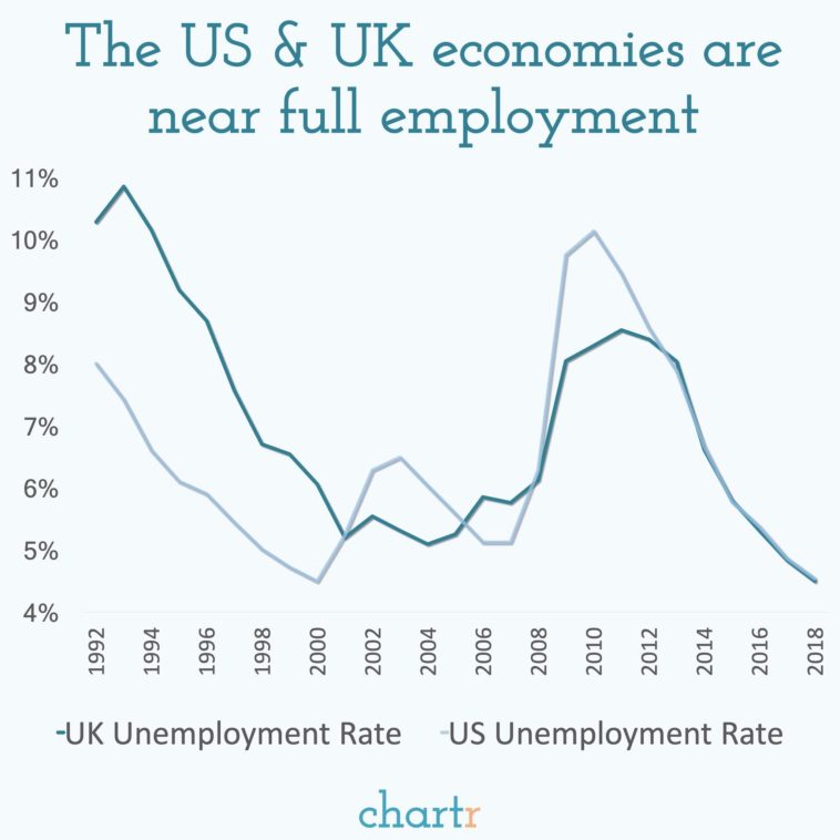
Data visualization : How closely UK & US unemployment rates have tracked each other over the last 6 years. [OC] from Instagram @chartrdaily.
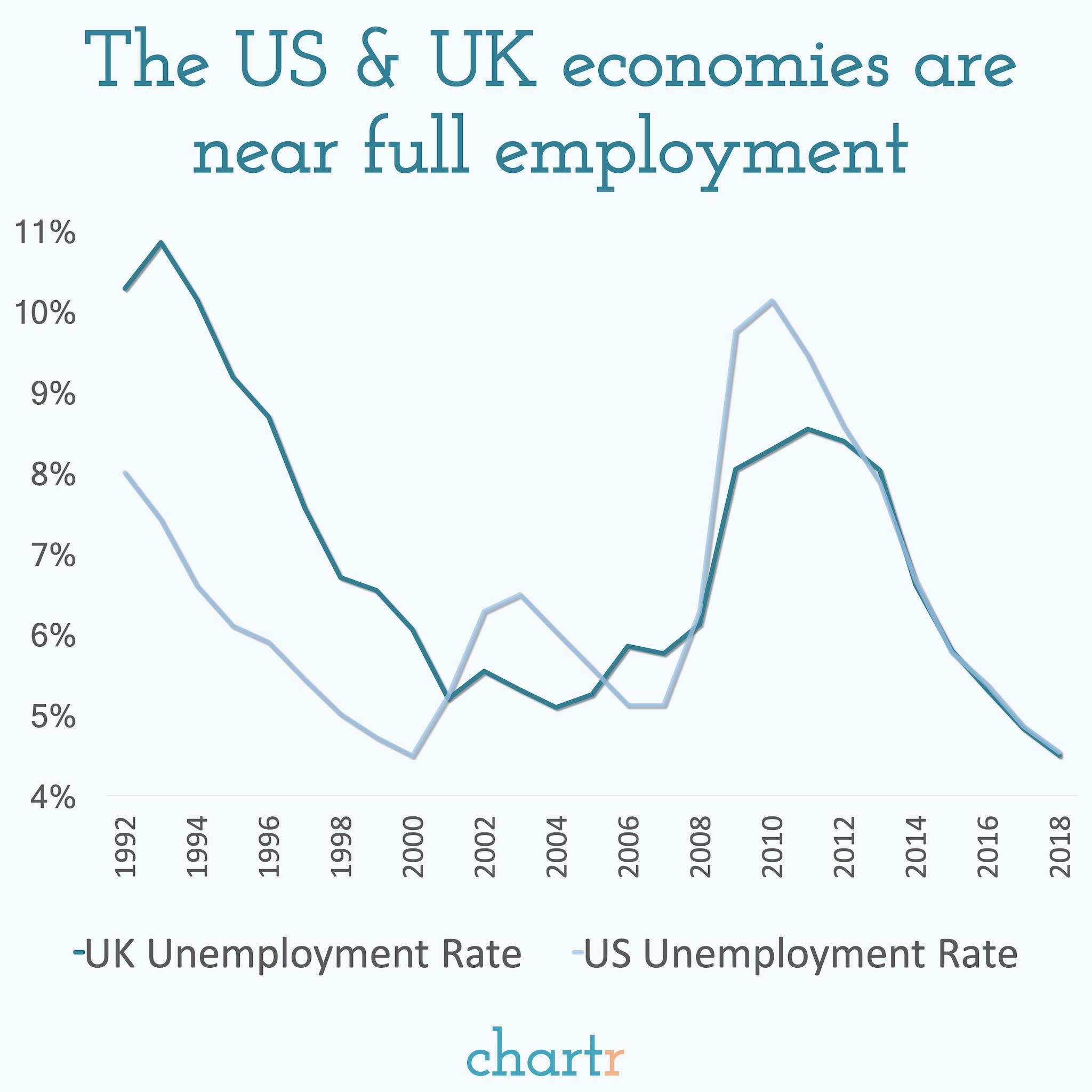
How closely UK & US unemployment rates have tracked each other over the last 6 years. [OC] from Instagram @chartrdaily.
By chartr
At infographic.tv we provide handpicked collection of the best infographics and data charts from around the world.