in

data visualization : [OC] A demonstration of the terrible shuffle algorithm Spotify originally used

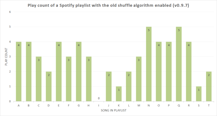
Data visualization : [OC] A demonstration of the terrible shuffle algorithm Spotify originally used

[OC] A demonstration of the terrible shuffle algorithm Spotify originally used

By bluesatin

At infographic.tv we provide handpicked collection of the best infographics and data charts from around the world.

  • Don’t forget to share the love !
  • What do you think?

    459 points
    Upvote Downvote

    Leave a Reply

    Your email address will not be published. Required fields are marked *

    Loading…

    Video Infographic : YOU VS LEATHERFACE – How Can You Defeat and Survive It? (The Texas Chainsaw Massacre Movie)

    Data Chart : Commonly Misspelled or Misused Words [Infographic