in

data visualization : [OC] A visualisation of how I felt throughout 2018

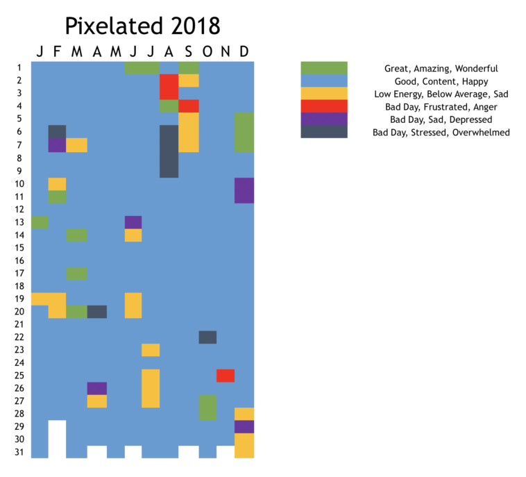
Data visualization : [OC] A visualisation of how I felt throughout 2018

[OC] A visualisation of how I felt throughout 2018

By LeChatParle

At infographic.tv we provide handpicked collection of the best infographics and data charts from around the world.

  • Don’t forget to share the love !
  • What do you think?

    459 points
    Upvote Downvote

    Leave a Reply

    Your email address will not be published. Required fields are marked *

    Loading…

    Map : Hemispheres (Source: Wikpedia, Google Maps)

    Data Chart : 11 Types Of Baby Poop And The Hidden Messages You Might Miss [Infographic