Data visualization : [OC] Density plot of PF/C in the NBA from 2015-2017 by proportion of points from 3
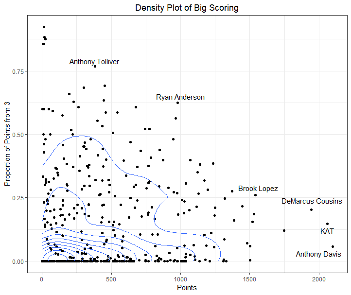
[OC] Density plot of PF/C in the NBA from 2015-2017 by proportion of points from 3
By wizwaz14
At infographic.tv we provide handpicked collection of the best infographics and data charts from around the world.