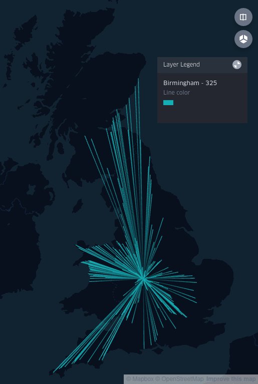
Data visualization : [OC] I took some suggestions from various reddit users, and improved my “Firework” diagrams of direct rail connections to main UK hubs. There’s also now maps for nine hubs rather than just two, and a bonus distance-weighted heatmap at the end.

[OC] I took some suggestions from various reddit users, and improved my “Firework” diagrams of direct rail connections to main UK hubs. There’s also now maps for nine hubs rather than just two, and a bonus distance-weighted heatmap at the end.
By kwn2
At infographic.tv we provide handpicked collection of the best infographics and data charts from around the world.


