Data visualization : [request] Real chart showing the percentage of population living in the new year (source: xkcd)
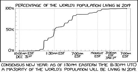
[request] Real chart showing the percentage of population living in the new year (source: xkcd)
By DarthJahus
At infographic.tv we provide handpicked collection of the best infographics and data charts from around the world.