in

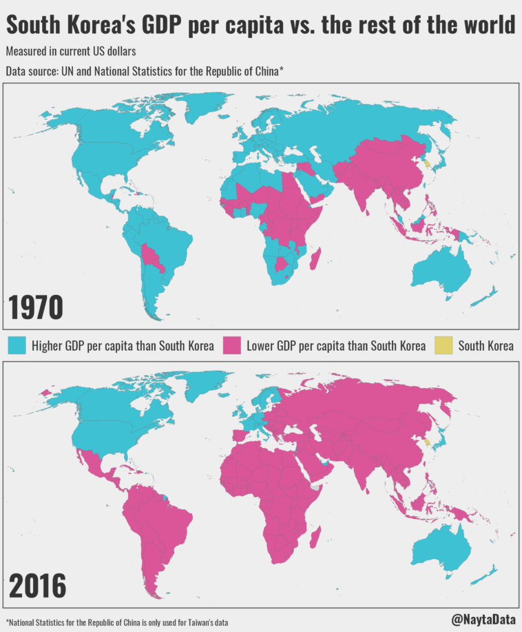
data visualization : South Korea’s GDP per capita vs. the rest of the world (1970 & 2016) [OC]

Data visualization : South Korea’s GDP per capita vs. the rest of the world (1970 & 2016) [OC]

South Korea’s GDP per capita vs. the rest of the world (1970 & 2016) [OC]

By NaytaData

At infographic.tv we provide handpicked collection of the best infographics and data charts from around the world.

  • Don’t forget to share the love !
  • What do you think?

    459 Points
    Upvote Downvote

    Leave a Reply

    Your email address will not be published. Required fields are marked *

    Infographic : Interior Home Design From Around The World.

    Chart : Mobile App Development Company