Data visualization : The ‘year summary graph’ of recording every 30 mins of my life in 2018
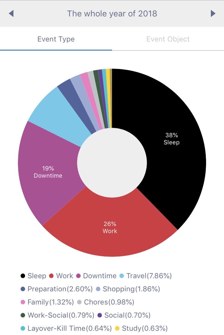
The ‘year summary graph’ of recording every 30 mins of my life in 2018
By molecular_chaperone
At infographic.tv we provide handpicked collection of the best infographics and data charts from around the world.