Data visualization : Visual Representation of Each U.S. State’s Wealthiest and Poorest County
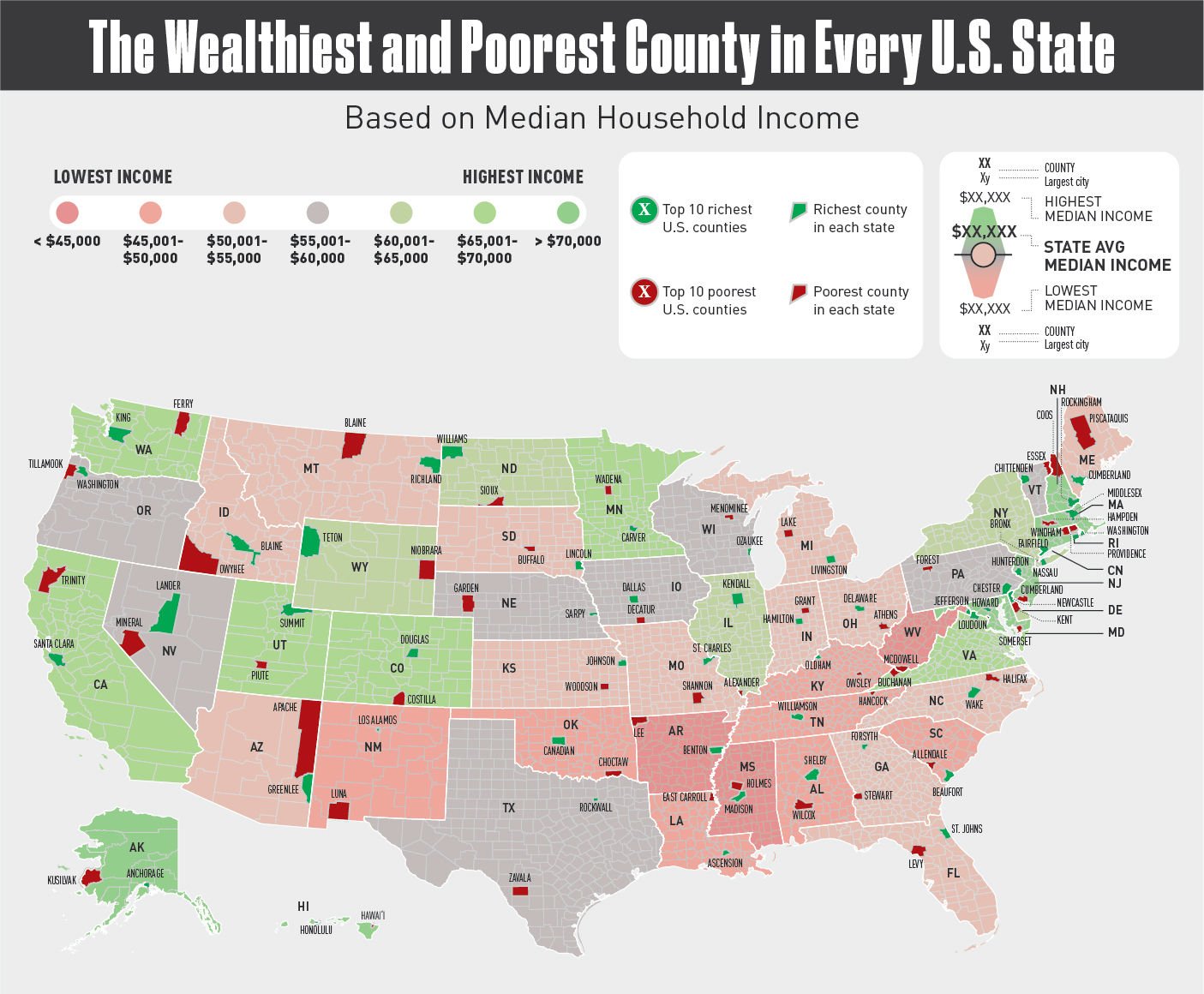
Visual Representation of Each U.S. State’s Wealthiest and Poorest County
By DifferentMountain
At infographic.tv we provide handpicked collection of the best infographics and data charts from around the world.