Data visualization : Where Wealth Inequality is Soaring, Gini Index 2013 – 2017 [OC]
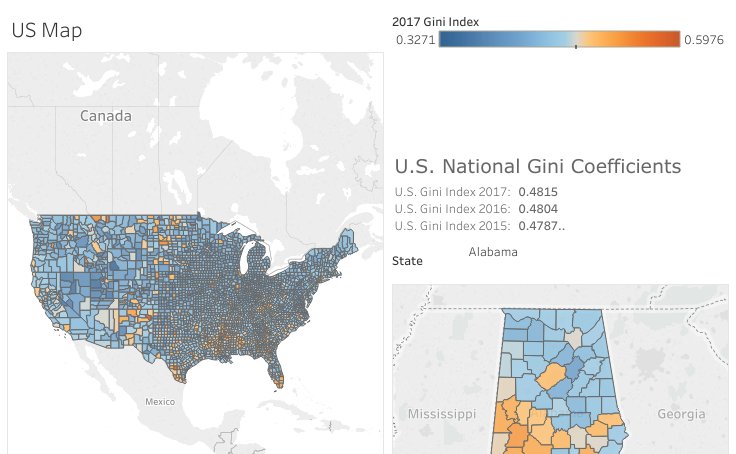
Where Wealth Inequality is Soaring, Gini Index 2013 – 2017 [OC]
By tinker_tailor_soldie
At infographic.tv we provide handpicked collection of the best infographics and data charts from around the world.