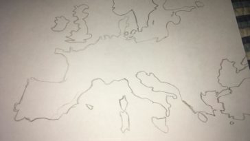
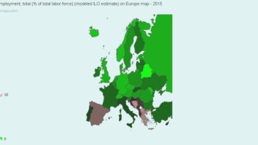
in Map Map : I eyeballed this, all my others that aren’t eyeballed are terrible so this is a major improvement
in Infographics Infographic : I made an infographic on Nominal Sector Balance, a.k.a why the U.S. has to run deficits
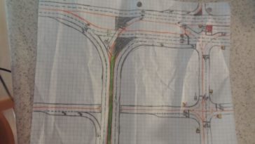
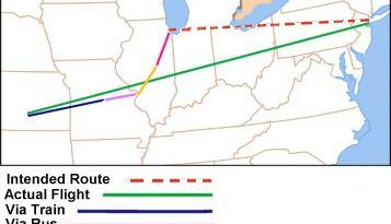
in Map Map : The route from Trains, Planes and Automobiles (1987) plotted out, with modes of transportation.