Infographic : Best of the visualisation web… November 2019
At the end of each month I pull together a collection of links to some of the most relevant, interesting or thought-provoking web content I’ve come across during the previous month. Here’s the latest collection from November 2019. (Note that some links lead to paywall items, for which you may have limited access before having to pay).
Visualisations & Infographics
Covering latest visualisation, infographic or other related design works.
Financial Times | ‘Pollution on London’s Zone 1 tube mapped for the first time’
Martin Telefont | ‘Dataviz Butterflies’
@RichardZimerman | Map showing ‘more than 3600 penguin colonies, colored by species’
Info.graphics | ‘Heatscore: 720 million hacked unique passwords, visualized’
Visual Cinnamon | ‘Kantar’s MotiveMix’
Nature | ‘This week’s cover shows Nature’s publication record over 150 years. Explore the growing web of collaboration and science in an interactive graphic.’
@undertheraedar | ‘English constituencies by winning party in 2017, and level of deprivation’
NZZ | ‘Federal departments: For women, the rungs on the career ladder are slippery’
Visualizing Health | ‘Our objective was to create a gallery of beautiful and easy-to-make-sense-of graphs, charts, and images that effectively communicate risk information. Health data that makes sense.’
National Geographic | ‘Sacred Mosaic: A Heritage of Architecture in Jerusalem’
Washington Post | ‘It’s been XX days since a high-profile departure from the Trump administration’
Dueling Data | ‘Income and health insurance coverage in NYC’
Spiegel | ‘An explainer why the world population is still increasing, even though the fertility rate has declined significantly’
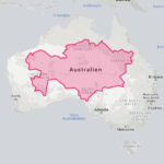
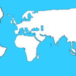
@volayaf | ‘Instead of creating awesome maps for the #30DayMapChallenge, I am going to do the opposite: wrong maps in each category to show common mistakes.’
Twitter | Browse through the hundreds of submissions contributing towards the #30DayMapChallenge
Articles
These are references to written articles, discourse or interviews about visualisation.
The Economist | ‘A year in Graphic detail: An analysis of The Economist data-journalism team’s first year in print’
Book Riot | ‘7 books that use data visualizations to help tell their stories’
Rash Design | ‘Telling A Story With Visual Data: A conversation with designer and data visualization specialist, Eric Rodenbeck.’
Venture Beat | ‘AR and VR will make spatial journalism the future of reporting’
LA Times | ‘How the U.S. betrayed the Marshall Islands, kindling the next nuclear disaster’
Reuters | ‘Building a Silicon Valley of the Sea’
Knowable Magazine | ‘Why scientists need to be better at data visualization’
@borism | ‘Drawing the Data Interface – Using Pen and Paper for Designing Innovative Data Visualisation Interfaces’
Nightingale | ‘Data, Empathy, Design, Information, and Experience: Saying Hello to 2020’
Learning & Development
These links cover presentations, tutorials, podcasts, academic papers, case-studies, how-tos etc.
@wiederkehra | Great thread about the design story behind the NZZ piece listed above
@aLucasLopez | Another great design thread on the workings behind the Nat Geo piece published above
@lilachmanheim | An interesting twitter thread and discussion about the intersection between perception and visualisation
@Arnold_Platon | ‘My talk at #EUDataviz, about the data gathering and harmonizing work that went into creating the first detailed, pan-EU maps of the European Elections’
SITE | Paper: ‘Graph Construction: An Empirical Investigation on Setting the Range of the Y-Axis’ by Jessica Witt
Data Stories | Great new episode with Randall Munroe of XKCD
Subject News
Includes announcements within the field, such as new sites or resources, new book titles and other notable developments.
Information is Beautiful Awards | ‘Information is Beautiful Awards 2019: The Winners’
Datawrapper | Interesting news that ‘Datawrapper will update its pricing’ from December 2019
FlowingData | ‘Growing Your Visualization Toolset (and Mine), a FlowingData Membership Update’
Refinery29 | ‘& Other Stories & Giorgia Lupi’s New Collab Celebrates Women In Science’
@jburnmurdoch | ‘A chilling attack on free speech #dataviz’
Dezeen | ‘Design agency Clever°Franke has created a logo for the Eurovision Song Contest 2020 that combines the flag and year that each of the 41 participating countries first competed.’
Mapbox | ‘New Storytelling Template lets you quickly build location-based stories with high-quality map visuals’
Sundries
Any other items that may or may not be directly linked to data visualisation but might have a data, technology or visual theme.
The Atlantic | ‘Introducing a New Look for The Atlantic’
@infowetrust | ‘Some very playful chart antics in this ad by @BrandNewSchool for @etrade’


