Infographic : DVS: “What Makes a Data Visualisation Elegant?”
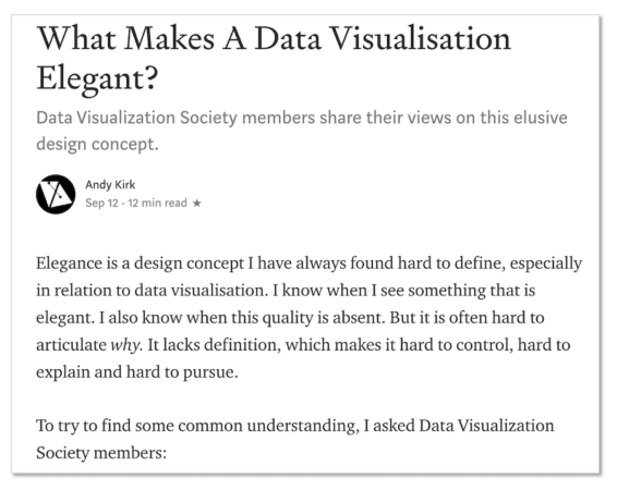
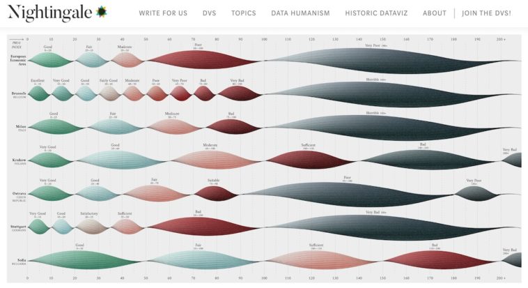
It was great to recently have the chance to curate a deep-dive discussion about a key topic in data visualisation on the Data Visualisation Society slack channel. My topic of choice was surrounding the issue of how one would recognise and pursue elegance in a data visualisation.
After a short delay, I’ve finally managed to find the time necessary to go through the multiple threads of rich discussions that emerged from this exercise and have formulated some sense of a summary post. It has now been published on the DVS Medium publication ‘Nightingale’. Many thanks to Duncan Geere and Jason Forrest for their editing and publishing assistance.


