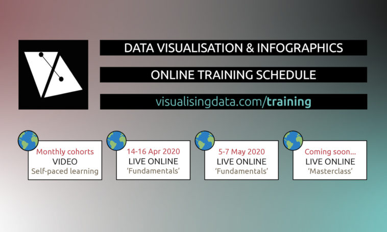
Infographic : New online data visualisation training courses
You will have noticed that life has become an extra bit turbulent, troubling and uncertain over the past few weeks. As increasing populations of people become mandated to stay at home, the way of working (quite aside from the way of living) has been suddenly forced off the normal tracks. For those of us whose business operations involves a significant amount of travel to deliver training events, talks and conduct consultancy with clients, there is a necessity to rapidly adapt to the new circumstances of widespread remote, online working.
Having delivered nearly 300 largely-classroom training courses in this subject over the past decade, the situation we are now facing has inevitably demanded a new approach. As a freelancer in a digital world, remote working has been part-and-parcel of my business model for the past decade but I was not expecting to face such an urgent need to adapt to delivering online only!
I have been fortunate to have plenty of experience giving webinars and delivering online teaching. Between 2012 and 2017, I taught on a masters degree, remotely from the UK, to students in the USA. In more recent times, I have also designed and delivered a number of commercial short-course training events, with a regular course being offered to a large market research society in Australia. The imposition of these new circumstances offers an opportunity to build on these previous experiences.
I’m therefore happy to announce details of new plans to pivot my data visualisation training offerings online. My approach has been to deconstruct the two main classroom training formats – the 1-day and 2-day events – and repackage the teaching, exercise and activity contents usually covered by each into suitable equivalent formats for delivering online.
I have carefully thought about the optimum conditions for creating a quality learning experience, especially to avoid the mental, physical and attention overload of sitting through an entire course in one or two full days. Therefore, the biggest difference in how these courses are now to be offered online is they are packaged up into shorter sequenced workshop sessions, running across several days. This will help our eyes, ears, and brains cope better. Thee sessions will still offer equivalent contact time for teaching the subject (if not more) and space for undertaking exercises to embed the learning, as well as offer extended activities for attendees to undertake between sessions in their private time.
The adapted online version of the 1-day course is now titled ‘Fundamentals of Data Visualisation & Infographic Design’ and this is the first event type I am launching in the immediate term. This course will exist as three 2-hour workshops, running across consecutive days. I am immediately scheduling two sittings of this course type, one in the middle of April and one at the start of May. The reason for this is to differentiate the running times of each event in order to be as compatible as possible with potential audiences across different timezones. The published times below are based on British Summer Time (which is what we switch to from Sunday 29th March).
Here are details of the first two live online events, with links to the Eventbrite registration pages and course brochures. The launch registration cost is discounted at £185+VAT per person. For some people outside of the UK, VAT charges may be exempt:
April 14-16 | 3 x 2 hour sessions running from 9am-11am BST. Register here or read the course outline.
May 5-7 | 3 x 2 hour sessions running from 3pm-5pm BST. Register here or read the course outline.
It is also worth reminding everyone of the additional availability of my online video-based data visualisation training provided and hosted by Sage Campus.
These courses run in regular monthly cohorts and offer a self-paced online platform to complete the learning at your own pace and in your own time. This might better suit those who are facing a more chaotic home life! The latest cohort started on Monday 23rd (there may still be chance to join) and I understand new monthly intakes will be confirmed soon to cope with increased demand.
Due to the fast-moving nature of designing these courses I have not yet finalised my intended choice of technology for delivering the live online teaching. I have narrowed down my options to three prospective platforms and will be trialling these over the weekend to identify the optimum offering. I will then update the details on the Eventbrite pages but I don’t anticipate there being much impact on the technical setup for attendees.
In due course, I will also launch an online version of my 2-day classroom training, which will be titled ‘Masterclass in Data Visualisation & Infographic Design’. As with the classroom events, the difference between this and the 1-day OR ‘fundamentals’ course is characterised simply by there being extra space to go deeper into the content covered and provides room for increasing the quantity of activities presented.
I will be looking to launch a public sitting of the ‘Masterclass’ course later in May once I have completed the ‘Fundamentals’ courses and trialed ’Masterclass’ course with an existing group of delegate who were due to attend a classroom event in April. Additionally, for those who may be interested, both new online course formats will be offered for organisations to arrange private events for their colleagues.
Please note that my teaching is NOT technical and does not involve any tutorial based instruction about any specific technology, though I do profile the tech landscape and provide plenty of useful resources to help you navigate through the options and their capabilities.


