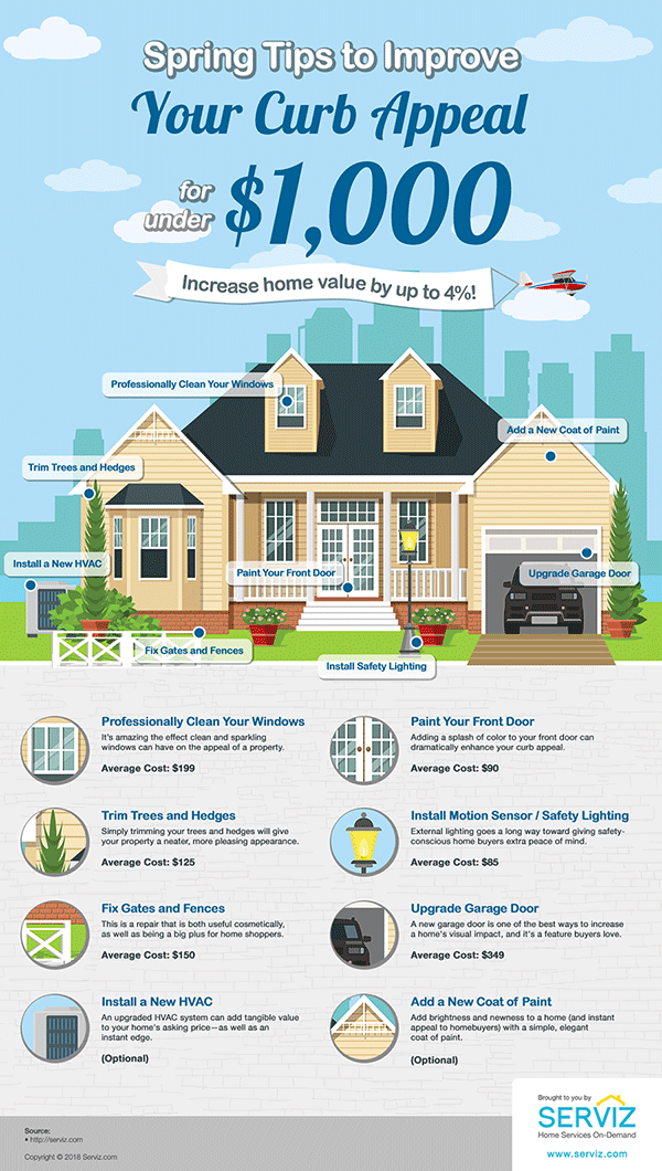
Infographic : Spring Tips to Improve Your Curb Appeal Infographic
Property is a popular topic for infographics and I do see many of them in my review of content. Most of these are a focus on the value of properties and how that can be increased – it is a hot topic.
I have always had an interest in interiors and property – if I could go back I would be an architect. I am a nester and love nothing more than making spaces and my particular preference is for minimalist architect style. Not to everyone’s taste but I can’t stand frills and fuss and fall very much into a sphere of efficiency.
Ornaments equal dusting and cleaning. Not efficient.
My pet hate is lots of shampoo bottles around a bath. Eugh.
Aside from my bare minimal style, if I was selling my property I think I would be good at staging an environment to make it appealing to buyers. I understand that not everyone shares my clutter-free living style and would consider what the primary objectives are for the target buyer – families, young couples or seniors.
Maybe I should get into property as by following a few rules you can increase your property value by 4% – just my thing.
Spring Tips to Improve Your Curb Appeal infographic covers practical tips that will increase the sale and value of your home, focused at the homebuyer/seller niche.
Design overall – 8
The graphic has a strong banner that features an plan illustration with labels that relate to each tip. A great opener and visually you instantly get a grasp of what you are looking at and what advice is on offer.
Typography – 7
All type is clear to read with suitable headings and subheadings.
Illustration – 8
The house illustration is a clear graphic style that complements the subject.
Content – 7
This content is on topic for the focused niche and offers practical tips and advice.
Overall score – 7.5
An infographic that could be printed as a poster and offers the content in an at-a-glance format. This works.


