in

Map : A map I just created – The red and gray zones have nearly equal populations

Map Info & Chart : A map I just created – The red and gray zones have nearly equal populations
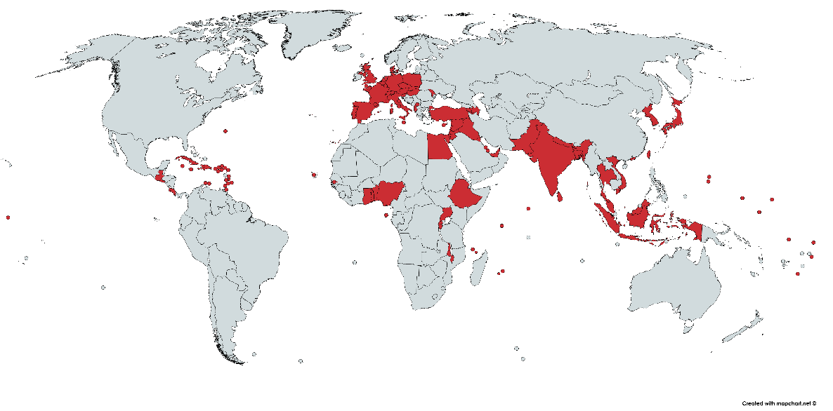
A map I just created – The red and gray zones have nearly equal populations

By birdsarerealSIKE

At infographic.tv we provide handpicked collection of the best infographics and data charts from around the world.

  • Sharing is caring !
  • What do you think?

    459 points
    Upvote Downvote

    Leave a Reply

    Your email address will not be published. Required fields are marked *

    Loading…

    Visual : cool guide

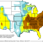
    Map : Annual probability of heat waves above human survivability limit in the United States in 2070 [OC]