Map Info & Chart : A map of what countries are most likely infected in The Walking Dead made by a man with no knowledge of country geography or the Walking Dead (the map creator I used wouldn’t let me color in Israel or Andorra, they’re both Countries that are most likely infected)
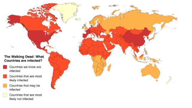
A map of what countries are most likely infected in The Walking Dead made by a man with no knowledge of country geography or the Walking Dead (the map creator I used wouldn’t let me color in Israel or Andorra, they’re both Countries that are most likely infected)
By elchuracodedoggo
At infographic.tv we provide handpicked collection of the best infographics and data charts from around the world.