in

Map : A no good very bad map of Europe

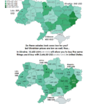
Map Info & Chart : A no good very bad map of Europe

A no good very bad map of Europe

By Eken321

At infographic.tv we provide handpicked collection of the best infographics and data charts from around the world.

  • Sharing is caring !
  • What do you think?

    459 points
    Upvote Downvote

    Leave a Reply

    Your email address will not be published. Required fields are marked *

    Loading…

    Infographic : Acetaminophen vs. Ibuprofen: Which Works Better Guide.

    Map : Ukraine, y’all might know that country is kinda poor, here you might see average monthly salaries as of November 2019 in USD. But at the same time ukrainian prices are low as well and beneath you may see the UA salaries converted to USA level, PPP matters a bit.