Map Info & Chart : Half of the world’e population lives in the areas marked with yellow.
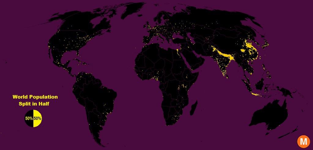
Half of the world’e population lives in the areas marked with yellow.
By Ddokidokis
At infographic.tv we provide handpicked collection of the best infographics and data charts from around the world.