Map Info & Chart : Left, Percentage of White Population by county(Blue). Right, Rate of IRS Audits(Red). Exact overlap shows IRS targets people of color.
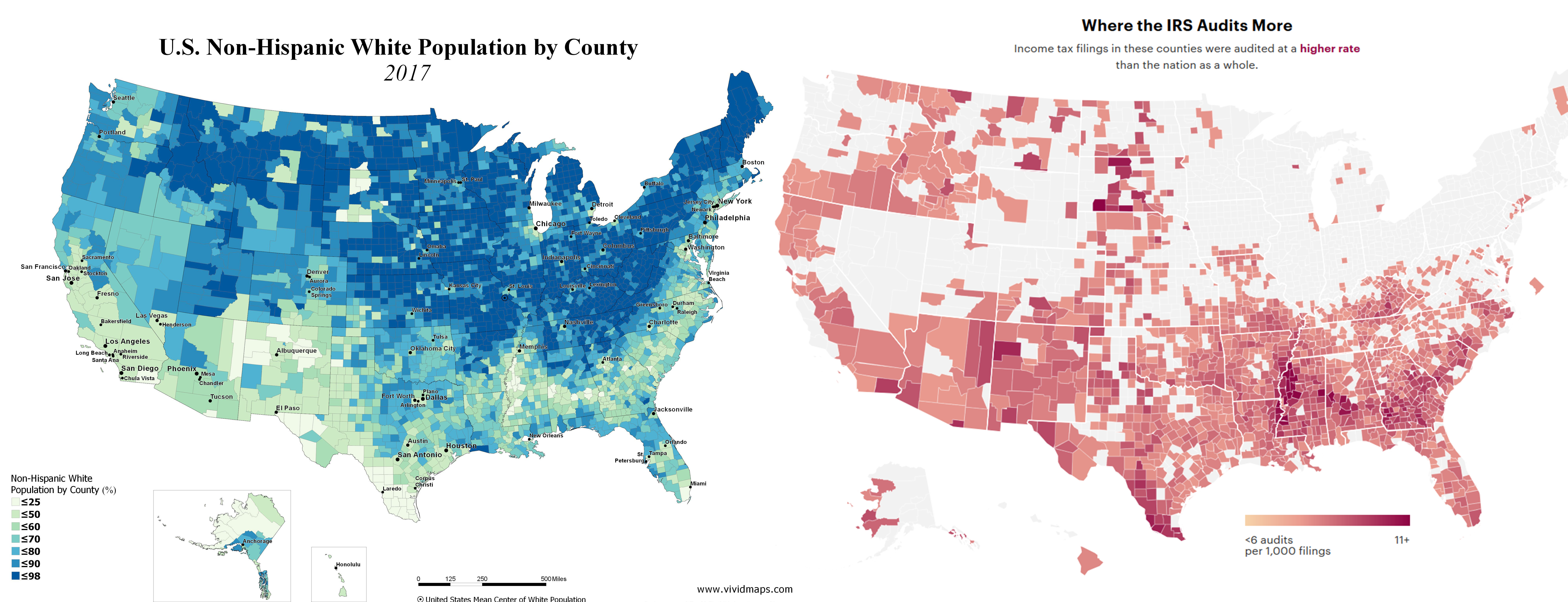
Left, Percentage of White Population by county(Blue). Right, Rate of IRS Audits(Red). Exact overlap shows IRS targets people of color.
By ElFantasmaDelC
At infographic.tv we provide handpicked collection of the best infographics and data charts from around the world.