in

Map : Map of number of people born in the given country currently living abroad, as a percentage of the total population, as of 2015

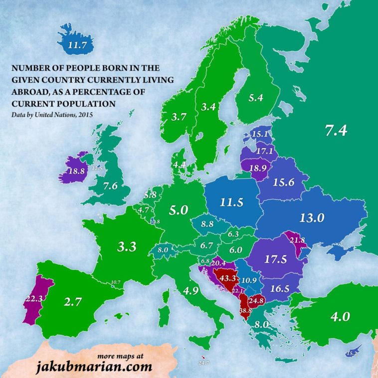
Map Info & Chart : Map of number of people born in the given country currently living abroad, as a percentage of the total population, as of 2015

Map of number of people born in the given country currently living abroad, as a percentage of the total population, as of 2015

By thethingisidontknow

At infographic.tv we provide handpicked collection of the best infographics and data charts from around the world.

  • Sharing is caring !
  • What do you think?

    459 points
    Upvote Downvote

    Leave a Reply

    Your email address will not be published. Required fields are marked *

    Loading…

    Video Infographic : THE SCALE OF STARBUCKS Infographic

    data visualization : Alternate view of repetition in a Portuguese Song. [OC]