Map Info & Chart : Population Change by Race in the Chicago Region from 2000-2010
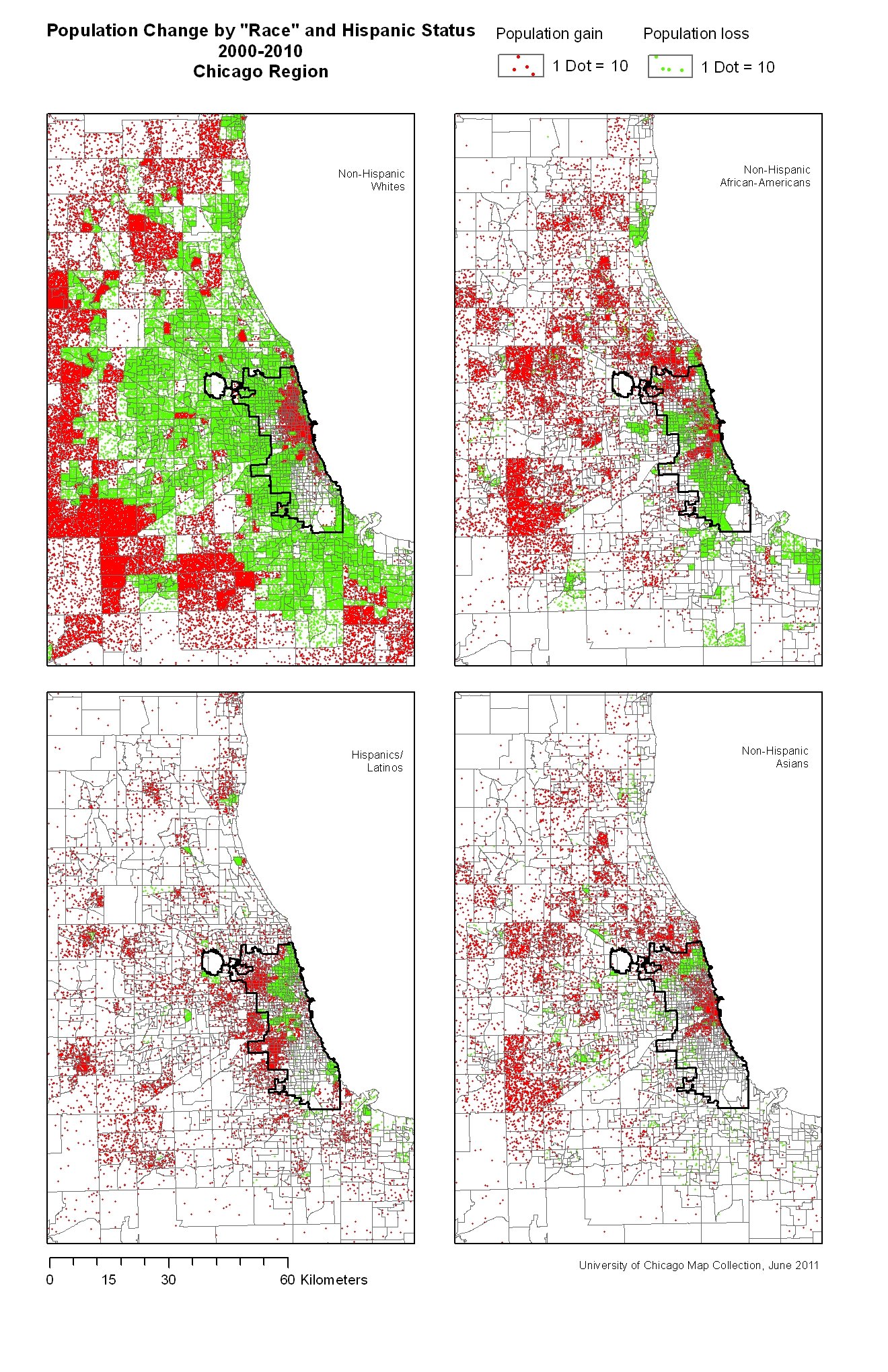
Population Change by Race in the Chicago Region from 2000-2010
By greetingsfromcanada
At infographic.tv we provide handpicked collection of the best infographics and data charts from around the world.