in

Map : Red and Orange Areas have Equal Populations

Map Info & Chart : Red and Orange Areas have Equal Populations
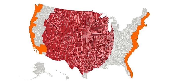
Red and Orange Areas have Equal Populations

By Cogo5646

At infographic.tv we provide handpicked collection of the best infographics and data charts from around the world.

  • Sharing is caring !
  • What do you think?

    459 points
    Upvote Downvote

    Leave a Reply

    Your email address will not be published. Required fields are marked *

    Loading…

    Visual : Sketch of Notre Dame Cathedral with pertinent notes and location of the scaffolding. Credits at the bottom of the sketch. Also, link to cutaway sketch in comments,

    Visual : Notre Dame, simplified