in

Map : Simulated satellite image of California circa 1851 vs image from 2013

Map Info & Chart : Simulated satellite image of California circa 1851 vs image from 2013
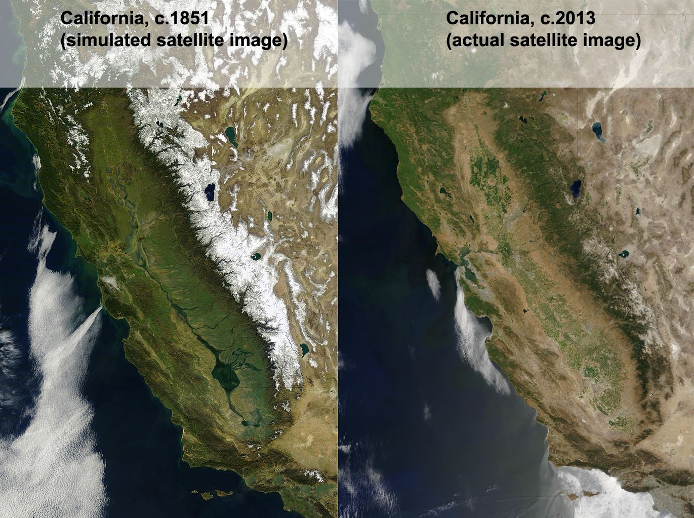
Simulated satellite image of California circa 1851 vs image from 2013

By Brennanthenerd

At infographic.tv we provide handpicked collection of the best infographics and data charts from around the world.

  • Sharing is caring !
  • What do you think?

    459 points
    Upvote Downvote

    Leave a Reply

    Your email address will not be published. Required fields are marked *

    Loading…

    data visualization : Shooting Pi – using random sampling to calculate pi by estimating area of a disk [OC]

    Data Chart : A Quick History of Tesla Motors [Infographic