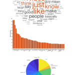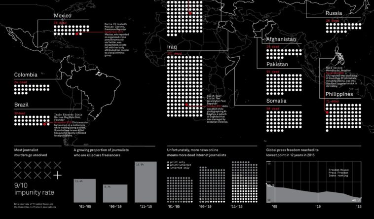
Map Info & Chart : This Occupation Has Become Deadly In Just One Decade
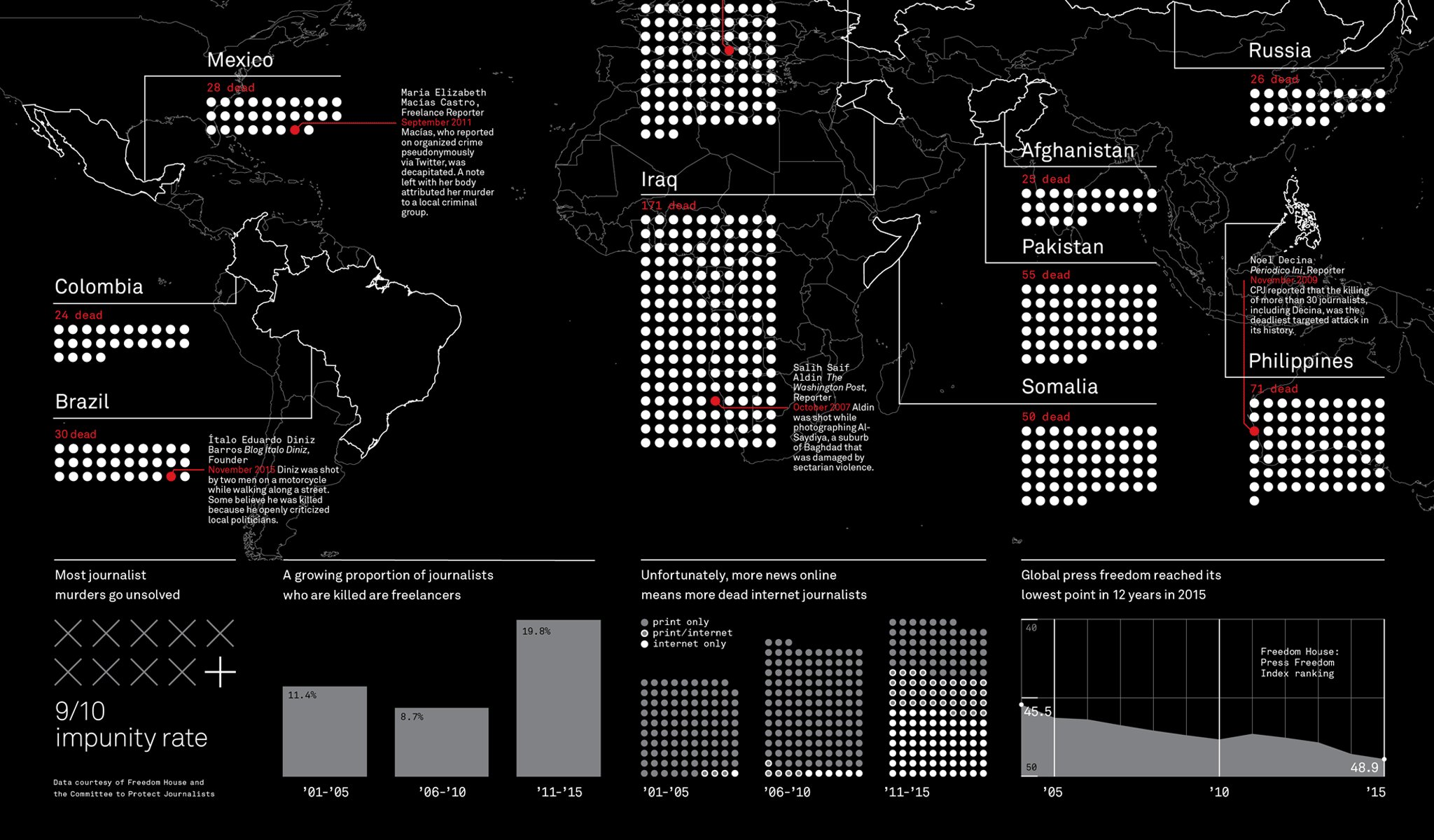
This Occupation Has Become Deadly In Just One Decade
By novoblade
At infographic.tv we provide handpicked collection of the best infographics and data charts from around the world.