Map Info & Chart : World map according to population size from the 19th to 22th century.
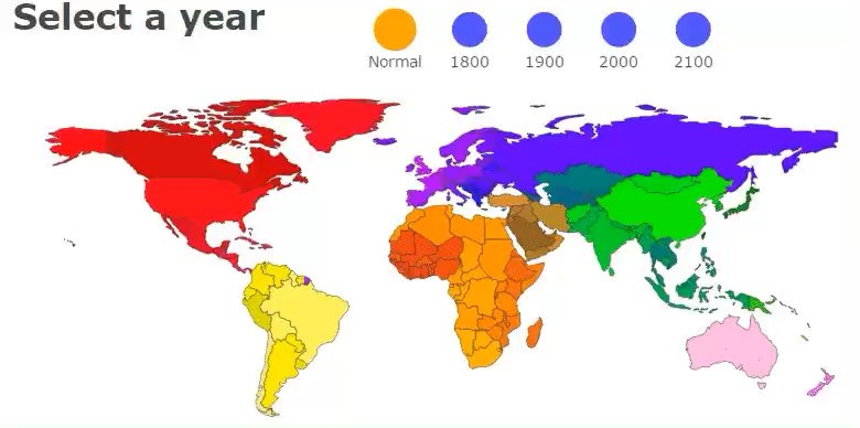
World map according to population size from the 19th to 22th century.
By Ddokidokis
At infographic.tv we provide handpicked collection of the best infographics and data charts from around the world.