Video Infographic : Editing Data Driven Infographics in Visual PowerPoint Graphs Pack
Video
Description
Product URL:
The data driven charts from our PowerPoint Graphs pack are highly visual.
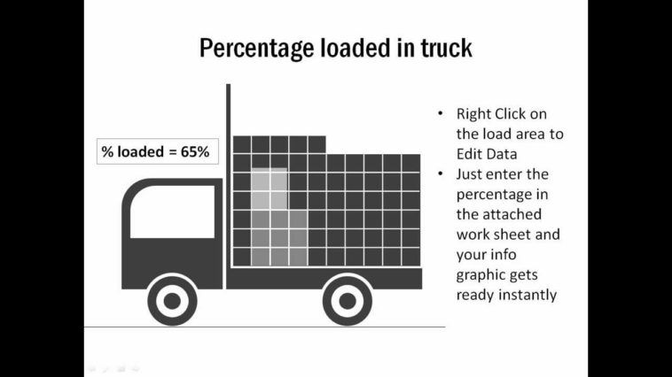
Though the info graphics looks like they are just a Clip art image, they are actually a data driven info graphic. You can easily use these info-graphic templates in your presentations, brochures, newsletters, demos and more.
The chart shows percentage completion, where each box represents a percentage point.
To edit the info graphic, click on the visual. When you see the bounding box, right click and go to edit data. A worksheet opens up.
Let’s change the ‘Percentage loaded’ from 65% to 43%.
Once you make the change and press Enter, you can see the change reflected in the chart instantly.
This is the updated chart. So, now your presentation slides can have the same insightful info graphs that you see in newspapers and magazines.
Go ahead! Browse through our large collection of data driven info graphics templates and customize them with your own data.
Demo Length: 1 Minute
Only At : Presentation Process